What a Heat Map Shows That a Stock Report Never Will

Every WMS we've ever connected to ships with a stock report. Some of them ship with a dozen variants of it. The reports are accurate, structured, and exactly the wrong tool for the question most operators are actually asking.
A stock report tells you what is in the warehouse.
A heat map tells you what the warehouse is doing.
Different question, different answer, and the difference is bigger than it sounds.
What the spreadsheet is good at
For the record, a good stock report is excellent for what it's designed for. It tells you:
- Total units on hand by SKU.
- Where each unit lives (which bin, which zone).
- The age of the stock.
- The available-to-promise number a sales team needs.
If your question is "do we have enough pumpkin spice candles to ship the campaign?" — the spreadsheet wins, every time. There's nothing a heat map adds.
Where the spreadsheet runs out of road
The questions a stock report struggles with — even with pivots, even with conditional formatting — are the questions that drive layout decisions:
- Which bins are working hard? Which are sitting idle?
- Where are the picks actually clustering?
- Which sections of the warehouse haven't seen a pick in a month?
- Is the layout supporting the SKU mix, or fighting it?
- Where are the bottlenecks during a 9am pick wave?
These aren't fundamentally hard data questions. The data is in the same WMS. The reason they're hard in spreadsheet form is dimensional: you're trying to render a three-dimensional warehouse into a two-column table, and the brain can't reconstruct the picture without the picture.
What a heat map adds
A heat map is the same data with the physical layout put back. Every aisle, every section, every tier in the rack, mapped to its actual location and color-coded by activity.
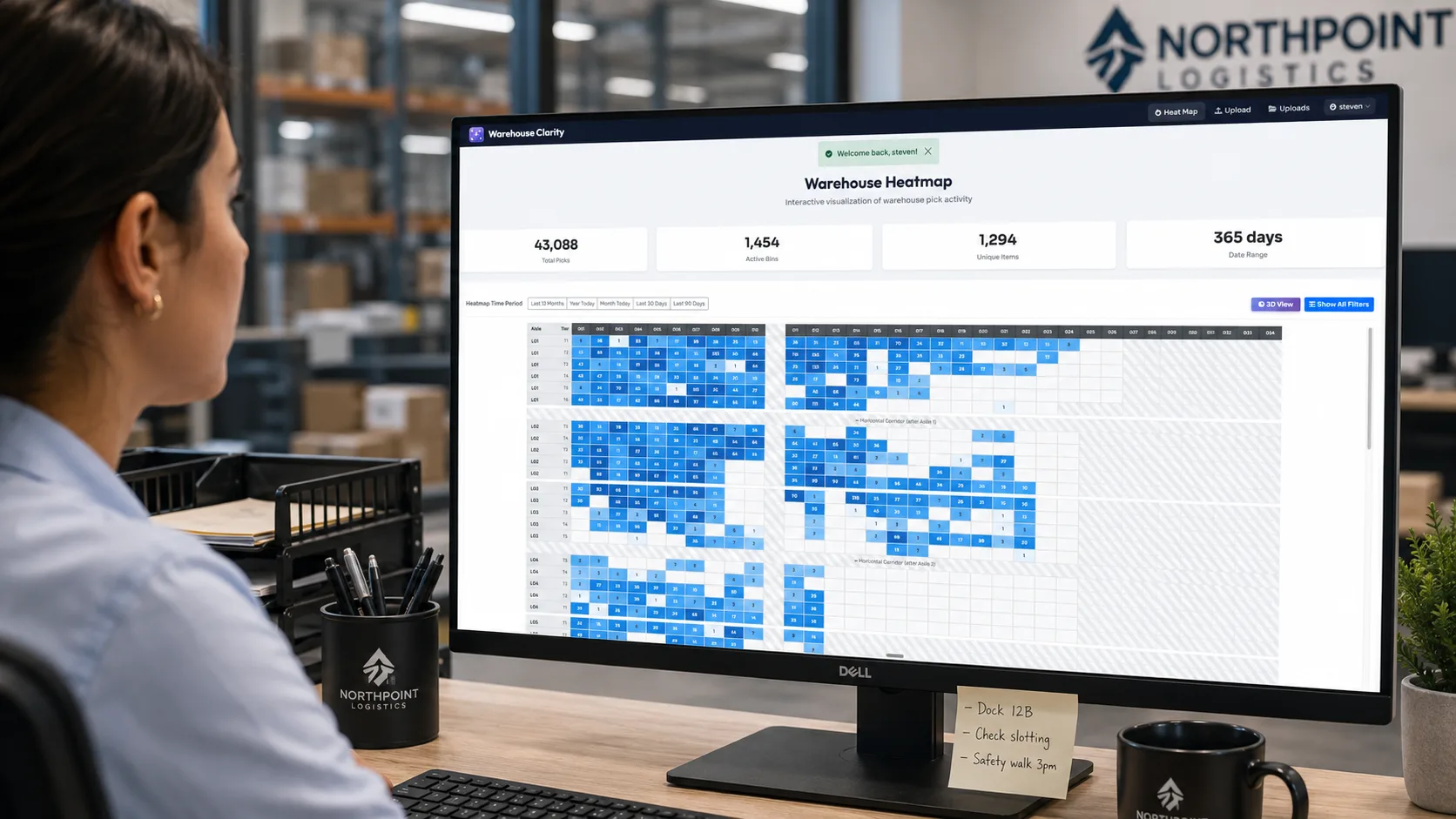
You can toggle the metric:
- Pick count — which bins moved the most in the last week.
- Pick velocity — picks per unit of stock, surfaces fast vs. slow movers regardless of inventory volume.
- Storage density — how full the bins actually are (the honeycombing view).
- Unique items — bins that hold a wide vs. narrow assortment, useful for replenishment thinking.
The data is from your WMS. The picture is new.
When ops directors see this for the first time, the response is almost always the same and almost always specific:
"Move that aisle of slow movers to the back. Get the top 200 SKUs into the front two aisles. We've been talking about that for two years."
The conversation existed already. What was missing was the slide that made the case.
Why the picture changes the meeting
There's a quiet political dynamic here that's worth naming. A spreadsheet recommendation lives or dies on whether the recipient trusts your read of the spreadsheet. A heat map recommendation gets evaluated on the picture itself.
If you're an ops director pitching a layout change to a CFO, or a 3PL pitching a re-slot to a client, the heat map is doing the heavy lifting on credibility. The CFO doesn't need to take your word for it that the back-left quadrant is dead — they can see it. That changes the meeting.
This is the reason most of our customers describe the interactive 3D view as the feature they actually use in stakeholder presentations. It's not because it's prettier. It's because it makes the argument legible to people who don't live on the floor.
Where each view fits
A practical guide:
| Question | Tool |
|---|---|
| Do we have inventory to ship? | Stock report |
| Where does a specific SKU live? | Stock report |
| Which bins are working hardest? | Heat map (pick count) |
| What's the dead inventory? | Heat map (pick velocity / activity date) |
| Are we using our cube? | Heat map (storage density) |
| Where should the top 200 SKUs live? | Heat map + slotting analysis |
| How do I explain this to a non-operator? | Heat map (3D view) |
This isn't an argument that spreadsheets are obsolete. It's an argument that they're the wrong dimension for the operational decisions a heat map was built for. Use the right tool for the question.
The drill-down matters
One more thing worth saying: a heat map is only as useful as its drill-down. A pretty picture you can't click into doesn't help an operator. The whole point is that you can see the warehouse, find the anomaly, click the bin, and see what's actually in it — pick history, current contents, last-movement date.
The Warehouse Heatmap view starts at the facility level and ends at the individual bin. One click from "this aisle looks dead" to "the dead bins are these 14 SKUs, last picked 87 days ago, here's what's in them."
That's the loop a stock report can't close.